Credit card payoff
Note: This product didn’t end up launching due to Tally’s shutdown in August 2024.
Overview
Tally is a credit card debt payoff program that uses a credit line and a personalized plan to help people pay off credit card debt. Tally’s primary value props are financial savings (save up to $4,300 on interest) and ease of use (let Tally manage your cards). It's a complicated product, made more complicated by its integration into Experian via a brand new SDK.
The project
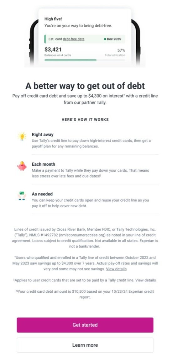
Create a primer page that clearly describes the primary features of Tally in a way that answers most user questions and is easy to understand.
My role
Sole Content Strategist, working collaboratively with UX Design and Research, Developers, Product Owners, Legal and Compliance representatives and Tally stakeholders.
The primer is the first step in the application flow. Users navigate to the primer from very short hooks with limited info, so this page has to do a lot of heavy lifting to support user engagement and limit drop-offs.
Sample entry hook
Low fidelity primer
Value props
Save an average of $4,300 on interest
Get a flexible, personalized payoff plan
Use a low-interest credit line to pay off high-interest debt
Reference to Tally as an Experian partner
Let Tally manage your credit card payments for you to avoid late fees and stress less
Get out of credit card debt faster—and for good
Keep your credit cards open and keep using them if you need to
Process
We received files from Tally highlighting their value props, legal requirements, and existing flows and screens. We got feedback that they wanted to stay as close as possible to their existing communication strategies.
My priority was to simplify their complex language to make it easier for users to scan quickly while maintaining user understanding. I worked with the UX Designer to define our strategy for including all the necessary info while keeping the screen simple.
User research
UXR performed a moderated usability test of the full application funnel and discovered the following:
1
Users felt misled by the payoff plan language after continuing and discovering they were in a credit line application funnel.
2
Users wanted to see information about their credit line offer (like the potential amount, APR, etc) earlier in the application funnel in order to understand how it could save them money.
3
Users were skeptical of running a credit check later in the application funnel. The credit check screen promises “no impact to your scores,” which users had trouble believing.
4
Users had trouble understanding the concept of the credit line and how it differed from a personal loan or credit card.
In collaboration with UX Design, I restructured the primer page to address some of the concerns users had throughout the funnel. We agreed a “Learn more” experience was necessary, based on general confusion about the purpose of the credit line and some mistrust about how it worked.
Primer
“Learn more” experience
UXR re-test results
1
The re-design was effective at telling users that the service is a credit line to pay off credit card debt. The majority of users understood that they would be applying for a credit line from Tally once they select “Get started”. They understood how a credit line was different from a loan.
2
The user expectation regarding early access to credit line and APR details was met.
3
Users didn’t express concern when encountering the credit check screen later in the funnel, due to preparatory language on this screen and some modifications to the credit check screen.
Conclusions
Changes made to the primer screen significantly improved user comprehension and decreased drop-offs.
Although brevity is valuable, clarity is key. Longer FAQ descriptions were critical to improving user comprehension. Fortunately, there wasn’t a hard character limit in this case.
The team agreed that video education or some other method of early user education might be more successful than lengthy FAQs. However, we arrived on a copy solution for MVP based on resources and timeline.
This screen continued to evolve as we went through legal review and Tally review. Some language was added or modified (ex. “Save up to $4,300”) based on changing legal requirements.


